

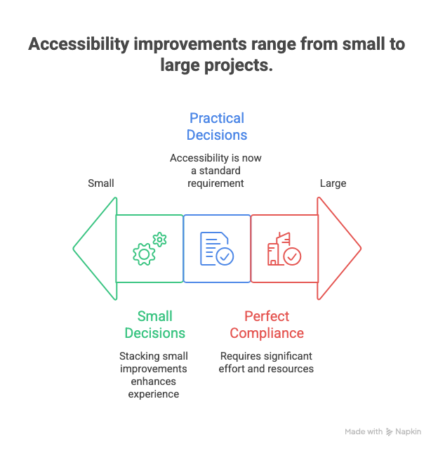
Accessibility used to feel like a specialist topic. In 2026, it is table stakes. Most teams are not failing because they do not care. They are failing because they think accessibility requires giant projects and perfect compliance.
The reality is simpler. Accessibility improves when small, practical decisions stack up. If you improve the way people read, click, perceive, and understand, you improve the experience for everyone.
This issue focuses on quick wins. Things you can ship this week without a full rewrite or a multi-quarter initiative.
In This Issue
• Why accessibility matters more in 2026
• What beginners misunderstand
• Five quick wins you can ship this week
• Two medium moves worth planning
• Resource Corner
• Final Thought
But first……
Happy MLK Day — A UXCON26 Special
MLK Day is a reminder of what forward movement actually looks like: learning, adapting, and pushing disciplines and communities into their next chapters. Progress never happens by accident… it happens because people choose to grow.

Today, we’re opening a short Early Bird window for UXCON26 available from now until Saturday night only.
This is more than a ticket. It’s an investment in the skills, perspectives, and conversations shaping the next decade of work.
The future belongs to those who learn how to leverage it.
🎟️ Early Bird ends Thursday night.
Back to where we stopped….
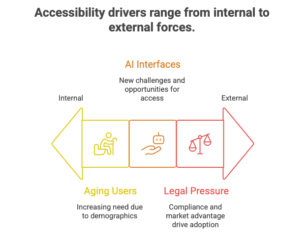
Why accessibility matters more in 2026
Three shifts are influencing accessibility today:
1. Aging user populations
More digital users are over 50. Motor, visual, and cognitive variance increases with age.
2. AI-driven interfaces
AI adds conversational, auto-generated, and multimodal interfaces. These can help or harm accessibility depending on implementation.
3. Legal and commercial pressure
More legal scrutiny means more companies treating accessibility like basic quality.
Accessibility simply means how easily people with different abilities can use a product.
Examples include vision, hearing, motor control, language processing, or cognitive load.
Accessibility is not only about disability. It is about variability.
What beginners misunderstand
Misunderstanding 1: Accessibility is only about screen readers
Screen readers convert text to speech for blind or visually impaired users.
But accessibility also includes contrast, captioning, motion, input types, and clarity.
Misunderstanding 2: Accessibility is expensive
Full remediation can be. Quick wins often are not.
Misunderstanding 3: Accessibility reduces creativity
The opposite is true. Constraints create clarity.
Misunderstanding 4: Accessibility is an edge case
Every edge case is someone’s everyday experience.
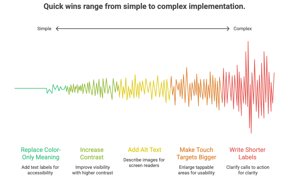
Five quick wins you can ship this week
These require no new infrastructure. Just attention and intention.
1. Replace “color-only” meaning
If color is the only difference, some users cannot perceive it.
Example: a red error vs a green success without labels.
Add text labels or icons so meaning survives when color fails.
Color-only signaling means relying solely on color to show status or meaning.
2. Increase contrast on primary actions
Buttons with low contrast disappear in sunlight, low vision, or fatigue scenarios.
Contrast ratio means how much a text or object stands out from its background.
Higher contrast improves recognition for everyone.
3. Add alt text to images in product surfaces
Alt text lets non-visual users understand images through screen readers.
Make it descriptive, not poetic.
Bad: “Image 27”
Better: “User tapping checkout button on mobile app”
Optimal: “Checkout button on mobile app confirming delivery and payment”
Alt text means a short written description read aloud by assistive technology.
4. Make touch targets bigger
Tiny touch targets frustrate users with motor challenges and users on small screens.
Recommended size: at least 44 x 44 px or equivalent in mobile units.
Touch target means the tappable area for controls like buttons, icons, and toggles.
5. Write shorter labels and clearer calls to action
Unclear labeling increases cognitive load and error rates.
Cognitive load means the mental effort required to process information or make decisions.
Replace vague labels with explicit ones:
Instead of: “Continue”
Use: “Continue to Payment”
Instead of: “Submit”
Use: “Place Order”
Two medium moves worth planning
These require more coordination but pay off significantly.
1. Caption all video and audio content
Captions help users with hearing differences and users in noisy or silent environments.
Push for native captioning, not burned-in text.
2. Add keyboard navigation support
Keyboard navigation allows interaction without a mouse.
This benefits users with motor challenges and power users who prefer efficiency.
Keyboard support means being able to navigate, operate, and submit using keys like Tab and Enter.
Tool of the week: Prompt Machine
Prompts are the new interface. If you’ve ever stared at a blank chatbox wondering how to ask AI the right thing, this tool fixes that.
We built this Prompt Machine helps you craft effective prompts for almost any task so you get sharper, faster, more useful outputs.
Resource Corner
Five accessibility trends to watch in 2026
Digital Accessibility & UX in 2026
Apple Human Interface Guidelines
Accessibility section is short and practical
https://developer.apple.com/design/human-interface-guidelines
Final Thought
You do not need to win accessibility in one sprint. You just need to stop treating it like a special project.
Accessibility improves when you:
• label more clearly
• reduce cognitive load
• rely on more than color
• support different inputs
• caption audiovisual surfaces
Small fixes compound.Everyone benefits. Quality is inclusive by default.
