


Experience creates conviction. Numbers open doors.
Every UX professional eventually reaches the same moment. The work is good. Users respond well. But leadership asks the question that decides resourcing, headcount, and roadmap influence.
What is the ROI?
This issue is about answering that question with clarity, credibility, and confidence. Just one page that shows the value of UX in a way business leaders take seriously.
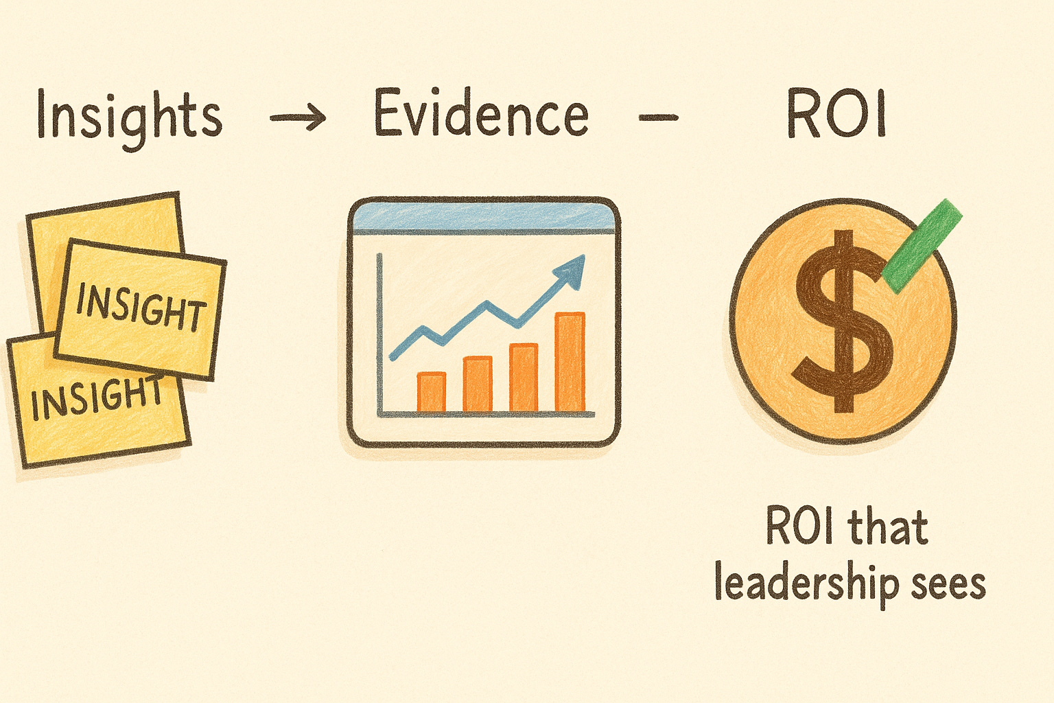
Simple diagram showing how UX insights translate into measurable impact.
In This Issue
• The real meaning of UX ROI
• The three numbers every UXer should track
• The one-page structure leaders understand
• Examples you can use
• Common mistakes
• Resource corner
• Final thought
Join Don Norman at UXCON26
Some people follow a field.
Others define it.
Don Norman belongs to the second group.
Long before “UX” became part of everyday language, his work was already changing how people think about design, usability, and human-centered systems. He gave structure to ideas teams struggled to explain, and language to problems designers felt but could not yet name.
Today, his influence stretches far beyond design. It lives in how products are shaped, how decisions are made, and how technology respects the people who use it.
Welcoming Don Norman to UXCON26 is a rare privilege.
Join us for a conversation that connects the foundations of UX to the future we are building next.
What UX ROI really means
UX ROI is not about proving design is important.
It is about showing how your work reduces cost, increases efficiency, and grows revenue.
Experienced UX professionals know this pattern:
• Good design reduces errors, confusion, and support burden.
• Clear research reduces rework and engineering waste.
• Better flows increase conversions and reduce drop-off.
• Improved clarity strengthens customer trust and retention.
ROI is the story of how UX prevents future losses and accelerates future wins.
The three numbers every UXer should track
You do not need a BI tool to quantify value.
You need these three numbers.
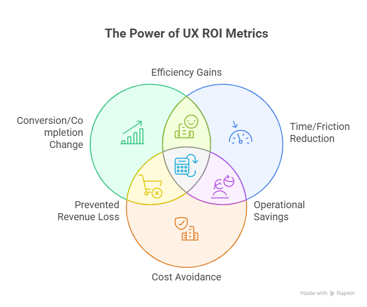
1. Conversion or completion change
Small percentage shifts here can be worth real money.
Example: Form improvements increase successful signups from 72 percent to 83 percent.
2. Time saved or friction removed
Support teams feel this first.
Example: A redesigned troubleshooting flow reduces average support tickets for one feature by 14 percent.
3. Cost avoided (the silent ROI)
UX prevents expensive mistakes.
Example: Early usability testing catches an issue that would have required six weeks of engineering rework.
These three metrics alone can carry an entire ROI conversation.
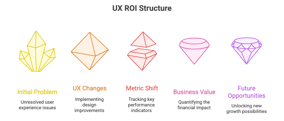
The one-page UX ROI structure leaders understand
Business leaders skim.
Your one-page ROI report should look like this.
Section 1: The problem in one sentence
Example: “Forty percent of new users drop off during setup due to unclear steps.”
Section 2: What we changed
Clear, simple, factual.
Example: “Simplified the setup flow from 7 steps to 4 and clarified the first-run instructions.”
Section 3: The metric shift
Before vs after.
Example:
Before: 40 percent drop-off
After: 22 percent drop-off
Impact: 18 percent improvement
Section 4: The business value
Translate impact into dollars or hours.
Example:
“An 18 percent improvement equals approximately 2,400 more successful onboardings per quarter.”
Section 5: What this unlocks next
Show you are thinking forward.
Example:
“This improvement reduces onboarding support load and increases the pool of users eligible for cross-sell.”
This one-page format earns trust because it respects their time.
Examples you can borrow
• “Reducing cart confusion increased completed orders by 11 percent.” - Here you can even go further and translate the orders in $ dollar. i.e. how much more revenue was the company able to generate.
• “Improved navigation reduced support tickets for billing questions by 28 percent.”
• “Streamlined onboarding added an estimated $380K in annual revenue opportunity.”
• “Fixing early usability issues avoided an estimated 6 weeks of rework.”
These are the kinds of statements that travel inside an organization.
Common mistakes
• Presenting artifacts instead of outcomes
• Using vague language like “improved clarity” or “better experience”
• Measuring too many things at once
• Forgetting to show the business value behind the metric
• Waiting until the end of the project to measure anything
ROI becomes clear when you track impact from day one.
Resource Corner
40+ UX Statistics: How to Prove UX ROI With Hard Data
Calculating the ROI of UX: A 5-Step Framework
Discussions and forums - How do we calculate ROI for UX Design?
Final Thought
UX earns influence through clarity.
A good one-page ROI summary speaks a language leaders cannot ignore.
If you want a seat at the table, show how a design decision changed a number that mattered.
When you can do that consistently, the conversation shifts from why UX to what do you need next.

