


A portfolio used to be a gallery of screens.
Then it became a stack of case studies.
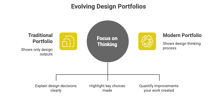
Now, teams want something different: a portfolio that shows how you think, not just what you designed.
2026 portfolios are less about aesthetics and more about clarity, decision-making, and outcomes.
Outcomes mean the measurable improvements your work created.
This issue breaks down exactly what modern UX portfolios must include and how to build one that feels thoughtful, sharp, and impossible to ignore.
In This Issue
• What changed about UX portfolios
• The 2026 clarity-first portfolio structure
• The five elements teams want to see
• Real examples
• Common mistakes
• Take-Home Exercise
• Resource Corner
What changed about UX portfolios
In 2026, portfolios must show judgment, not noise.
Judgment means the ability to choose the right direction based on evidence.
The shift happened because:
• AI generates screens easily
• Teams want to understand your reasoning
• Companies care more about outcomes than visuals
• Portfolios that confuse people get closed fast
A strong 2026 portfolio feels clear, crisp, and confident.
🧠 Don Norman is coming to UXCON26
Yes, that Don Norman. The godfather of user experience. He’ll join us for a live Q&A session and a closing keynote to help us reignite the roots of our field, where we started, where we’re going, and how we thrive together now.

Tickets are 25% off for the next 24 hours.
If you have been waiting for a sign, this is it.
Join us, learn from a legend, and experience what the future of UX can be
The 2026 clarity-first portfolio structure
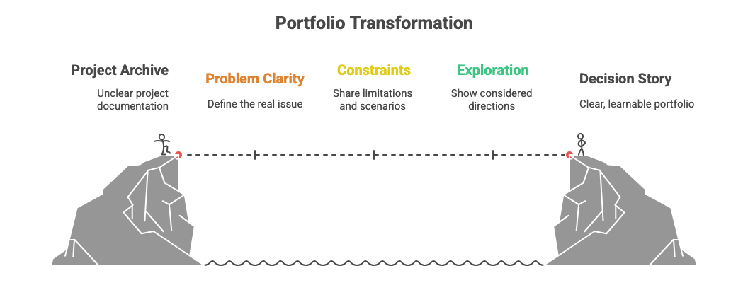
Think of your portfolio as a decision story rather than a project archive.
Use this structure:
1. Problem clarity
Explain the real issue you were solving.
A problem is the user struggle or business obstacle that needed change.
2. What made the problem hard
Share constraints, tricky scenarios, or competing needs.
Constraints mean the limitations shaping your options.
3. The path you explored
Show the directions you considered and why some were rejected.
Options show your thinking, not your polish.
4. The decision you made and why
Explain your choice in one or two sentences.
A decision is the moment your reasoning becomes visible.
5. The outcome
Show what improved.
Outcomes mean measurable benefits like reduced friction, faster task completion, or more people completing a flow.
This structure creates a portfolio people can actually learn from.
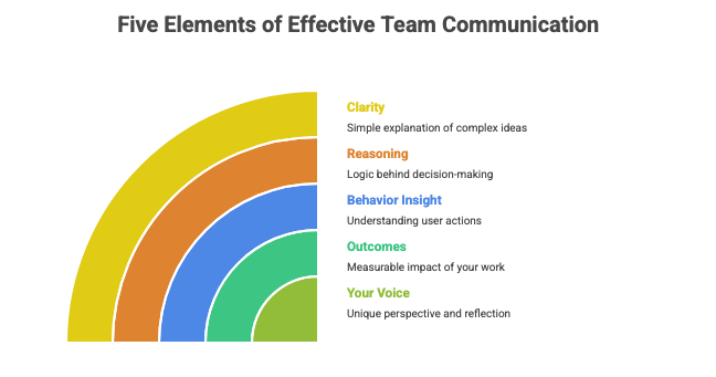
The five elements teams want to see
1. Clarity
Clarity means explaining complex work simply.
If your case study reads smoothly, people assume you think smoothly.
2. Reasoning
Reasoning is the logic behind your decisions.
Teams want to see how you moved from insight to solution.
3. Behavior insight
Behavior insight means what real users actually did, not what they said.
Your portfolio should show how you interpreted behavior.
4. Outcomes
Outcomes show your impact, even if the numbers are small.
Example:
“Error rate dropped from 18 percent to 11 percent after simplifying the form.”
5. Your voice
Your voice means how you think, reflect, and explain your work.
It is the piece AI cannot replicate.
A portfolio with these five elements stands out instantly.
Real examples you can borrow
Example 1: Onboarding Redesign
Problem: New users dropped off after step one.
Why it was hard: Conflicting needs between simplicity and feature education.
Path explored: Three flows; one removed friction but hid value, one over-explained.
Decision: Choose the flow that asked fewer questions upfront.
Outcome: Completion increased by 9 percent.
Example 2: Pricing Clarity Fix
Problem: Users hesitated at checkout due to unclear price differences.
Why it was hard: Needed clarity without overwhelming users.
Path explored: Icons, tables, and side-by-side comparisons.
Decision: Use a simple, two-line explanation.
Outcome: Drop-off improved by an estimated 6 percent.
Example 3: Dashboard Cleanup
Problem: People could not find recent activity data.
Why it was hard: Legacy layout created deep hierarchy.
Path explored: Search-first, reorder-first, category-first.
Decision: Reorder-first for lowest friction.
Outcome: Time to find data reduced from 22 seconds to 9 seconds.
These examples highlight thinking, not decoration.
Common mistakes
• Starting with visuals instead of the problem
• Writing long stories with no decisions
• Showing dozens of screens with no explanation
• Using generic phrases like “we improved usability”
• Avoiding outcomes because the numbers were small
• Forgetting that readers skim
A portfolio that overwhelms is a portfolio that gets skipped.
Take-Home Exercise
Use this exercise to turn any past project into a 2026-ready portfolio piece.
Step 1: Pick one project
Choose a project where you made at least one meaningful decision.
Step 2: Write a one-sentence problem statement
“What was the user struggle or business need”
Step 3: List three constraints
Examples: limited time, unclear data, conflicting needs.
Step 4: Describe two paths you explored
Write one sentence for each.
Step 5: Explain your final decision and why it was right
Keep it short and confident.
Step 6: Find one outcome
Even if small.
Examples:
• error reduction
• faster task completion
• lower drop-off
• improved clarity during testing
Step 7: Cut anything that does not support the decision story
This turns any project into a clear, senior-level case study.
Resource Corner

Don’t Let These Mistakes Sink Your UX Portfolio!
How to Present Your UX Portfolio or Case Studies During Interviews
Portfolio creation sites like UXfolio and Cofolio, a database of UX portfolios and case studies from design interns who worked in Fortune 500 companies
Final Thought
A 2026 portfolio is not a gallery.
It is a demonstration of how you think.
When you show clear problems, honest constraints, real decisions, and meaningful outcomes, people trust your process. They feel your maturity. They see your value.
Clarity is the strongest differentiator you have.
Build your portfolio around it.

