
Why Users Quit Before They Finish the Task
The Hidden Cost of Unclear Next Steps


Quick Take
When users stop mid-task, it’s rarely because they “don’t care.”
Most drop-off happens because the next step feels unclear or uncertain.
Today’s Gameboard builds awareness around guiding user attention.
The Hidden Cost of Unclear Next Steps
Imagine using a government form website.
You complete Section A.
Section B.
Section C.
You scroll down and you’re stuck.
Where is the button to continue?
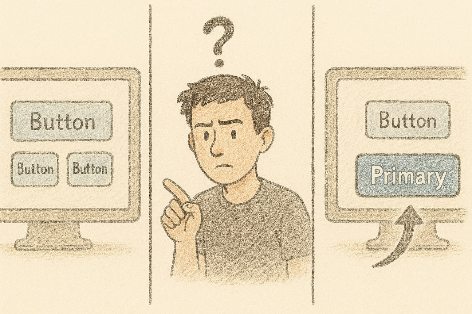
There is a button.
It just doesn’t look like the “next step” in the user’s mental flow.
When users are unsure, they hesitate.
When they hesitate, they drop off.
How to Fix It
Make next steps visible without scrolling.
Never hide progress controls below the fold.Use direct, simple CTAs.
“Continue to Payment” works better than “Next”.Reduce cognitive load.
Each screen should focus on one clear purpose.
Guidance is not hand-holding.
It is designing so the user can move forward without second guessing.
The 1-Day UX Career Breakthrough Workshop
📍 Alexandria, VA | Nov 22 | Only 30 seats available
If applications are going nowhere, interviews feel inconsistent, or your portfolio just isn’t landing… the problem isn’t your ability. It’s the strategy behind how you’re presenting it.
In one focused day, UX leaders Joe Natoli and Rajeev Subramanian will help you rebuild that strategy , clearly, confidently, and step-by-step.

You’ll walk away with:
✅ A stronger LinkedIn profile that speaks to hiring managers
✅ A personal brand that actually attracts recruiters
✅ Outreach and interview practice that feels natural, not forced
✅ A 90-day roadmap that points directly to your next UX role
🎯 One day. Clear direction. A career that moves forward again.
UX Gameboard Challenge
Scenario
Maya is booking a flight. She selects her dates, chooses her seat, enters her information, and then reaches the payment page.
There are two buttons:
“Continue”
“Proceed”
She isn’t sure which one confirms the booking, and which one just moves her to the next screen. The uncertainty increases her anxiety around payment. She closes the page and says she’ll “come back later.”
Your Challenge
Identify 1 to 2 causes for this hesitation.
Suggest one UX change that reduces anxiety and clarifies the final step.
Think you know the answer? Drop it in the comments for a chance to be featured in next week’s Gameboard reveal!
Quick Tip: Stress Test Your Buttons
Ask users: “What will happen when you click this?”
If their answers differ, the button needs clearer wording.
Thanks for being here.
Thanks for thinking deeply.
Thanks for caring about users.