
Why Ignoring Edge Cases Is Hurting Your UX
The Cost of Skipping Edge Case UX

Most UX teams focus on the 80% (The core flow. The ideal path. The happy users).
But what happens when someone veers off the golden path… accidentally, inconveniently, or because they just don’t fit the mold?
Edge cases aren’t just bugs to avoid… they’re insights into your blind spots.
This issue explores the invisible corners of UX: the edge cases we skip, the people we overlook, and the product trust we break when we fail to design for the unexpected.

What Exactly Is an Edge Case?
Why Ignoring the “Outliers” Hurts Your Core Users Too
Cost of Skipping Edge Case UX
How to Prioritize Edge Case
Error States, Dead Ends, and Offboarding
What Inclusive Design Can Teach
Product Examples
Resource Corner
Before We Get Into It…
🇺🇸 Memorial Day is a time to pause… to remember those who gave their lives in service to something bigger than themselves.
It’s a moment of reflection. Of honoring sacrifice. Of recognizing that the freedoms and systems we rely on today were shaped by people who never got to see the results of their efforts.
In our own small way, UX shares a bit of that spirit.
We work behind the scenes to improve systems, support others, and build experiences that outlast us even if our names aren’t on them.
In that spirit, we’re offering a Memorial Day discount for UXCON '25… to help more UX professionals invest in their growth, leadership, and impact.
Access the Memorial Day Discount → UXCON '25
Now, let’s get into today’s issue:
What Exactly Is an Edge Case?
An edge case is any user scenario that falls outside the “normal” or expected flow.
It might be:
Someone with a very slow internet connection
A user signing up from an unsupported country
A parent trying to use your app one-handed while holding a baby
A person who enters invalid data or forgets their password three times in a row
A customer searching for something your product doesn’t offer
Edge cases are not bugs.
They’re real … just not the kind of real we plan for first.
Too often, we design for the majority and call everything else “rare.”
But edge cases aren’t rare for the people experiencing them. They’re their entire experience.
Why Ignoring the “Outliers” Hurts Your Core Users Too
We often think of edge cases as someone else’s problem.
But they can reveal cracks in the foundation.
For example:
A confusing form error might frustrate 2% of users today… until it becomes 20% during a product launch.
A poorly designed offline mode might only affect people with bad connections… until your international rollout begins.
An inaccessible component might only block one screen reader user… until it triggers a lawsuit.
Designing for edge cases makes your product stronger for everyone.
It’s not about perfection. It’s about resilience.
From Friction to Failure: The Real Cost of Skipping Edge Case UX
Ignoring edge cases leads to:
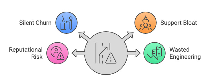
Silent churn — users give up and never tell you why
Support bloat — overwhelmed help desks fielding preventable problems
Reputational risk — when overlooked users take to social media or reviews
Wasted engineering — because fixing edge cases after launch costs more than designing for them up front
Edge cases aren’t extras.
They’re weak points and every user hits one eventually.
How to Prioritize Edge Case Design Without Losing Focus
Let’s be real: you can’t solve every edge case in every sprint.
But you can build a system for recognizing and responding to them.
Try this:

Log and tag them early. Use a dedicated column in your backlog or workshop board.
Quantify risk. Not just how often it happens, but how badly it breaks the experience when it does.
Group by pattern. You’ll find that many “edge” cases follow common breakdowns: navigation dead ends, system limits, data mismatches, etc.
Triage collaboratively. Involve support, dev, and legal… they often see edge cases before you do.
Designing for them doesn’t mean shipping more.
It means shipping smarter.
Error States, Dead Ends, and Offboarding: The Forgotten UX Moments
Most products focus on getting people in.
Fewer plan for when people mess up or leave.
That’s where trust is built or broken.
Some examples:
A search page that says “No results. Try again later.” with no guidance or alternatives
A form that clears your data when an error occurs
A subscription flow that makes cancellation a puzzle
A broken link that leads to a cold 404 page
These aren’t rare events.
They’re neglected ones.
And when users do encounter them, they remember.
What Inclusive Design Can Teach Us About Edge Thinking
Inclusive design starts where edge case thinking lives: at the margins.
Designing for people who are:
Neurodiverse
Non-native speakers
Using assistive tech
Dealing with temporary impairments (like a broken wrist or loud commute)
...forces us to clarify what we actually mean by “usable.”
As Kat Holmes wrote in Mismatch,
“When we design for the margins, we inevitably benefit the masses.”
Designing for one-handed users improves usability for all.
Closed captions help in noisy rooms.
Clearer navigation helps everyone.
Edge thinking isn’t just empathy. It’s durability.
Product Examples: Who’s Doing It Well?
GOV.UK — Designs for “stress cases” like users with no printer, bad connections, or limited ID. Their Design System is built around edge inclusivity.
Airbnb — Handles host cancellations, refund complexity, and emergency travel situations with calm, contextual UI and thoughtful support UX.
Apple — Their accessibility features (like voice control and dynamic type) go far beyond compliance — and improve general usability for aging users, multitaskers, and low-light settings.
Resource Corner


Final Thought: Don’t Design for the Edge — Design From It
Most innovation doesn’t come from the middle.
It comes from the margins.
Designing for edge cases isn’t just an act of empathy.
It’s a strategy.
For building more useful, flexible, human-centered experiences for everyone.