What If Your UX Work Doesn’t Move the Numbers?
Is It Still Good UX If the Metrics Don’t Move?
You ran the tests. You fixed the flow. You cleaned up the UI.
And… nothing.
No spike in conversion. No drop in support tickets. No round of applause.
It’s a quiet reality for many UXers: you do good work, and the numbers don’t reflect it. Does that mean your design failed? Or is something else going on?
This issue is about what happens when the data doesn’t validate your effort — and how to rethink progress in a field where impact doesn’t always show up right away.
Why Good UX Work Doesn’t Always Show Immediate Results
UXCon25 memorial day discount ends tonight
Types of UX Impact
Real Reasons the Numbers Might Not Move
How to Communicate UX Value
Why Teams Stop Trusting UX
How to Learn From a “Failed” UX Project
Resource Corner
Why Good UX Work Doesn’t Always Show Immediate Results
As UXers, we’re trained to believe in clear cause and effect:
Redesign a page = higher conversion
Shorten a form = more completions
Streamline a flow = fewer drop-offs
And yes, sometimes it works exactly that way.
But often, it doesn’t. At least not right away.
Why? Because UX doesn’t exist in a vacuum.
Even when your design decisions are solid, they’re part of a bigger moving system — and that system can muddy the results.
For example:
You fix a broken sign-up flow, but engineering delays push the release by a month.
You improve usability on the pricing page, but a marketing campaign sends traffic from the wrong audience.
You simplify onboarding, but a new feature launch causes user confusion.
You redesign the cart, but pricing changes make users second-guess purchasing.
You test a new layout, but it’s Q4, and user behavior is all over the place.
Suddenly, your clean UX improvements are buried under five competing changes.
So when the metrics don’t move, it’s not always because your work missed the mark.
It might just be noise or timing.
Before we continue…
We know what it’s like to keep putting things off.
You tell yourself you'll invest in your growth later… when there's more time, more clarity, more confidence.
But the truth is…
The moment is now.
Because the conversations that change your path don’t always wait.
And neither does this offer.
Our Memorial Day discount for UXCon25 ends tonight.
Access the Memorial Day Discount → UXCON '25
back to where we stopped..
Types of UX Impact (And Why Only One Gets Measured)
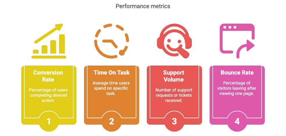
Most organizations focus on one kind of UX impact: quantifiable results.
Conversion rate
Time on task
Support volume
Bounce rate
But there are two other kinds of impact that are just as real - and often more meaningful:
1. Emotional impact:
Does your design make users feel more confident? Less frustrated? More in control? These moments are hard to measure but easy to feel.
2. Strategic impact:
Are you improving the experience before it breaks? Are you aligning cross-functional teams? Are you reducing tech debt or closing knowledge gaps?
Great UX work often prevents problems, rather than producing dramatic spikes.
But the dashboard won’t show you what didn’t go wrong.
Real Reasons the Numbers Might Not Move
If your redesign isn’t moving the needle, it doesn’t always mean failure. It might mean:
You solved the wrong problem (or just part of it)
External traffic or behavior changed mid-test
You introduced usability improvements that support retention, not acquisition
Your changes reduced confusion but didn’t influence short-term metrics
The thing you fixed wasn’t the highest friction point
Impact takes time.
Sometimes the real outcome shows up 3 months later… in fewer churned users, fewer angry emails, or more users successfully completing tasks they used to avoid.
How to Communicate UX Value When the Data’s Flat
When numbers stall, the temptation is to go silent — or defensive. But this is where communication matters most.
Try this:
Share what you prevented. (e.g., “Before, 28% of users were dropping off. Now, it’s 18% … but that’s across multiple touchpoints, not just one flow.”)
Share qualitative results. (e.g., “In post-test interviews, users said the process felt clearer, even if completion rates didn’t spike.”)
Tell the full story. Include timeline shifts, traffic changes, and team dependencies. It shows context, not excuses.
UX isn’t about vanity metrics.
It’s about clarity for the user and the business.
Why Teams Stop Trusting UX (and How to Rebuild That Trust)
Honestly, when results are slow, stakeholders get skeptical.
Not because they don’t respect UX… but because they don’t understand it.
To rebuild trust:
Be transparent about what success should look like and when
Show your reasoning, not just the design
Include constraints and tradeoffs in your recap
Ask for shared metrics, not just UX ones
Frame “flat” results as a learning opportunity not a loss
Stakeholders trust what they can understand.
And your process is part of your proof.
How to Learn From a “Failed” UX Project
A UX project isn’t a failure just because it didn’t hit a target.
But if it didn’t deliver expected results, ask:
Did we solve the wrong problem?
Did we launch at the wrong time?
Did we expect results too fast?
Did we test the design in isolation, or in the context of the full product?
Did we define success with enough nuance?
Every “flat” result is feedback.
Sometimes, it’s just not the kind we hoped for.
Resource Corner
Final Thought: Flat Metrics Aren’t the End of the Story
The dashboard doesn’t always tell the truth.
But your work still matters.
It matters to the person who found what they needed without stress.
To the user who didn’t rage-quit.
To the stakeholder who finally saw a customer’s pain clearly for the first time.
Not every win shows up in a chart.
Sometimes, it shows up in trust, clarity, and the fact that someone kept going.


