
User Experience: Designing for the Unpredictable
Designing for the Unexpected

Your User Flow Makes Sense—Until a Real User Uses It
You had it all figured out. The perfect onboarding flow. Clean, logical steps. Polished wireframes.
Then you test it... and a user skips Step 2 entirely, taps something weird, and somehow still gets to the end.
Confused? Frustrated? Welcome to real UX.
Because here’s the hard truth: your users won’t always follow your blueprint.
They’ll take shortcuts, use things out of order, and sometimes, completely ignore what you thought was “clear.”
This isn’t failure—it’s a signal. And it’s time we started designing for it, not around it.

Why user behavior is unpredictable (and what that tells us)
The traps we fall into by assuming users “follow the flow”
How to design flexible systems that hold up in real life
Smarter usability testing that catches what metrics don’t
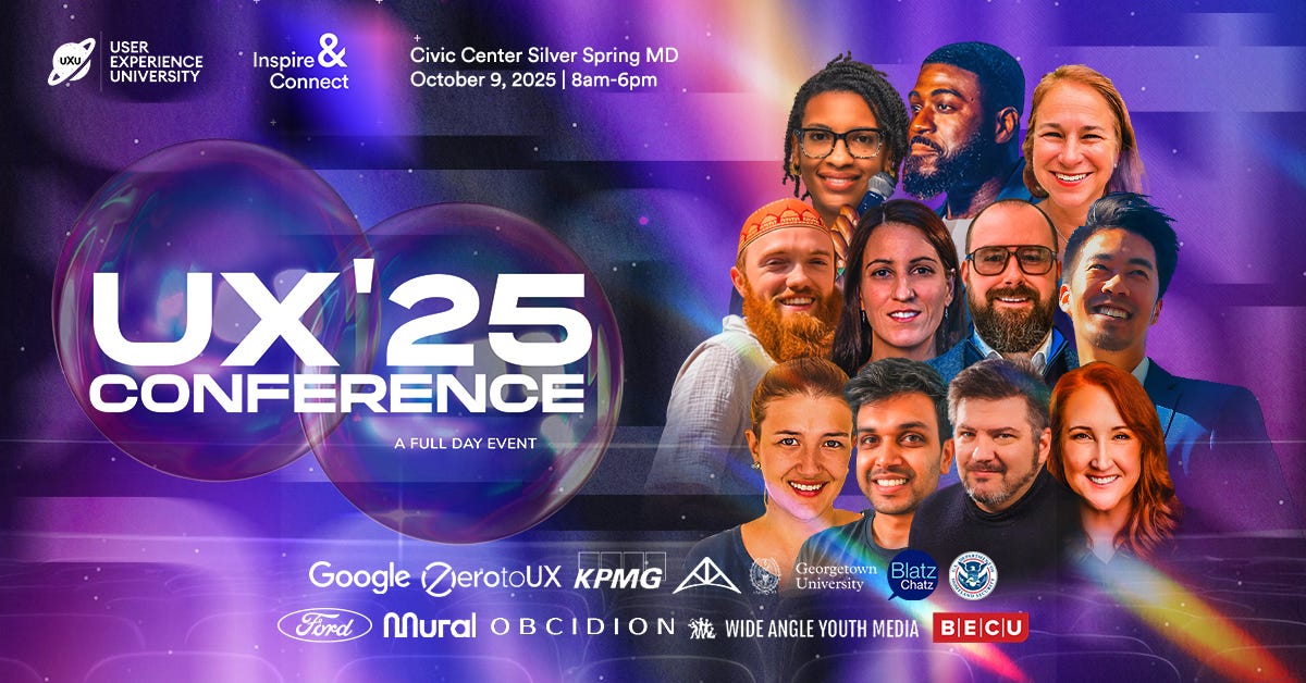
UXCON '25: Advancing your UX Career
Resource Corner: Learn more about behavioral design and usability
Tool of the Week: FullStory
Why Is User Behavior So Unpredictable?
Because they’re human. And real-life context is chaotic.
They don’t land on your interface with a checklist of steps. They land with habits, assumptions, and goals that may not match yours.
One study by the Nielsen Norman Group found that users spend less than 15 seconds on a webpage before deciding whether to stay or leave. That means design decisions need to anticipate instinctual behavior—not just logical steps.
And sometimes, those instincts surprise us.
Take this: In early mobile UX testing, researchers noticed that many users tried tapping static images in apps—assuming they were videos or buttons. Designers hadn’t considered this. But users were applying expectations from other apps. It wasn’t “bad behavior.” It was consistent with their lived experience.
Behavior always has a reason—even if we don’t see it at first.
🪤 The traps we fall into by assuming users “follow the flow”
We love a clean journey map. A linear path. A happy user who goes from A → B → C.
But real people?
They go from A → skip B → accidentally tap D → back to C → wonder what just happened → then maybe bounce.
Here’s where we often get it wrong:
We design for ourselves.
It’s called the “false consensus effect”: assuming users think like us. But they don’t.We over-script usability tests.
Giving users exact tasks like “find and use the filter” gets you clean data—but hides real issues. Most users don’t think in features; they think in goals: “I need to compare prices.”We dismiss unpredictable behavior as “edge cases.”
But when enough edge cases appear, they aren’t edges. They’re reality.
A quote we love from Jared Spool:
“If you have to explain it, it’s not good UX.”
But here’s an addition:
If you assume users will “figure it out,” they probably won’t.
Designing for the Unscripted
So how do we design for people who ignore our scripts?
We don’t make the user predictable—we make the system flexible.
Here’s what that looks like:

1. Design for multiple paths
Don’t force a single “correct” sequence. Let users reach the same goal in more than one way. Think of email drafts: some users enter the recipient first, others last. Both are valid. Design for both.
2. Support weird behavior
If users consistently misuse something, that’s a pattern worth designing around—not blocking. The best UX adapts.
3. Stress-test your interface
What happens if a user has no data? Too much data? Misses a step? Input errors? Designing for these “fail states” is where the real UX resilience lives.
4. Watch for creative workarounds
Microsoft Excel is a case study in user appropriation. It was built for spreadsheets—but users turned it into a planner, a CRM, a design tool. That didn’t happen despite Excel’s flexibility—it happened because of it.
Better Testing for Real Behavior
Usability testing often fails to surface real-world issues. Why?
Because it’s too tidy.
Here’s how to make it better:
Test in context. Let users use their own devices, in their own settings. Real context reveals real behavior.
Give goals, not instructions. Instead of “click this, then that,” try: “Find something you’d actually buy.” Let them explore.
Don’t explain the interface. If something needs explaining in a test, it needs better design.
Watch where they struggle—and where they improvise. The gaps between your flow and their path? That’s your design opportunity.
🎟️ UXCON '25 : The Future Is Unpredictable—Design for It
This year, at UXCON '25, we’re talking about real behavior. The messy, nonlinear, human kind.
→ What happens when AI meets unpredictable users?
→ How do we design for trust, autonomy, and reality—not just patterns?
→ What does UX look like when the “flow” isn’t a flow at all?
Whether you're early in your career or leading product at scale, UXCON '25 is where we ask better questions—and learn how to build for what’s real.
🎟️ And our 2-ticket bundle is still open. Bring your PM, your lead, or that one teammate who’s always advocating beside you.
Get the 2-ticket bundle—grow together, not alone.
📚 Resource Corner
Why Designers Think Users Are Lazy (NN/g) - A breakdown of misunderstood user behavior—and how to design with empathy.
The Design of Everyday Things – Don Norman - A foundational book on design psychology and real human behavior.
UX Metrics That Matter - A great guide to behavioral UX measurement—and what to stop tracking.
🛠️ Tool of the Week: FullStory
FullStory lets you replay real user sessions and see behavior that metrics alone can’t show. Rage clicks. Hesitations. Unexpected loops. You’ll uncover patterns you didn’t know existed—and fix things you didn’t know were broken.

Instead of asking “What’s wrong with this page?”, watch what users actually do on it.
Final Thought: Control Is a Myth. Design for Chaos.
The best UX isn’t the one with the most polished flow.
It’s the one that still works when the user stumbles, backtracks, skips, or improvises.
We can’t control people.
But we can create systems that respect how people actually move, think, and feel.
When users behave “unexpectedly,” they’re not breaking the experience.
They’re showing us what it needs to become.