
Understanding Cognitive Load: Designing for Mental Ease
Cognitive Load and User Experience


You’ve likely heard the term cognitive load before, but do you know what it really means in the context of UX? For many, it’s a vaguely understood concept related to user effort, but in reality, it's crucial to the effectiveness of a design. Cognitive load refers to the mental effort required for a person to process information, make decisions, and complete tasks.
When you design an interface, you’re essentially creating a mental environment where users perform tasks. And, just like a physical workspace, if it's cluttered or overwhelming, people are likely to become frustrated and fatigued. Understanding cognitive load allows you to streamline your designs, making them more intuitive, user-friendly, and efficient.
Let’s dive deeper into how cognitive load affects users, why it matters, and how you can design with it in mind.
What is Cognitive Load?
Cognitive load is the mental effort a user expends to process information and complete a task. The human brain has limited capacity for processing information, so if a design is too complex, it demands more from the user than they are able or willing to give.
There are three key types of cognitive load that affect how users interact with your design:
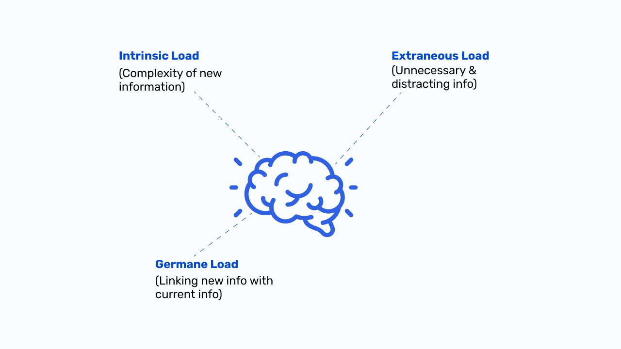
Intrinsic Cognitive Load: This is the natural difficulty associated with the task itself. For example, learning to use a new tax-filing app will inherently require more effort than browsing a photo gallery. It’s based on the complexity of the subject matter.
Extraneous Cognitive Load: This is the unnecessary mental effort imposed by poor design. Bad layouts, too many steps, confusing instructions—anything that adds complexity without adding value. Reducing this load is crucial for creating intuitive and seamless experiences.
Germane Cognitive Load: This is the mental effort directed at learning and mastering a task. It's the effort that helps users make sense of what they’re doing, which is beneficial in small doses. Good design fosters germane cognitive load by supporting users in understanding and mastering the interface without overwhelming them.
The goal in UX is to reduce extraneous cognitive load and keep intrinsic and germane cognitive loads at levels that are manageable and conducive to user success.
Only 17 days left until UXCon 2024! 🚨

Ready to rub shoulders with UX pros from NASA, Google, and Lockheed? This one-day event is where you level up, make career-changing connections, and get inspired by UX legends like Joe Natoli & Nikki Anderson!
⏳ Time's ticking—don’t get left behind!
Why Does Cognitive Load Matter in UX?
When cognitive load is too high, users can’t focus, understand, or remember key information. This leads to frustration, decision fatigue, and, ultimately, task abandonment. When people visit an app or website, they’re trying to accomplish a goal—whether that’s making a purchase, signing up for a service, or gathering information. Your design should facilitate that process, not make it more difficult.
Here’s how cognitive load can negatively impact UX:
Decision Fatigue: If a user is bombarded with too many options (think dropdowns, forms, buttons), they’ll struggle to make choices and may even give up entirely. Imagine a checkout page with 20 shipping options—this increases the mental load on the user, potentially causing frustration.
Reduced Retention: The more information you throw at users in a short span of time, the harder it is for them to remember. For example, a user visiting an e-commerce site for the first time may not retain product details if they’re also trying to navigate promotions, ads, and complex menu systems.
Task Abandonment: If a process feels too mentally exhausting, users won’t hesitate to abandon it. For instance, if signing up for a service requires multiple steps, including uploading a photo, creating a password, and agreeing to multiple terms, some users may drop off before completion.
How to Design with Cognitive Load in Mind
Designing for cognitive load means understanding the mental limits of your users and ensuring your designs don’t overwhelm them. By making the process of navigating your interface as intuitive as possible, you’re reducing the amount of unnecessary mental effort users have to exert.
Here are five key strategies for designing with cognitive load in mind:
1. Prioritize Essential Information
In most digital interfaces, not all information is immediately necessary. Show users only the essential information they need at a given time, and progressively reveal secondary details as they proceed. This method, known as progressive disclosure, prevents overwhelming users by keeping their mental load light in the early stages.
Example: When filling out a multi-step form, users should see only the fields they need to complete at that moment. Once that step is completed, reveal the next set of fields. Don’t present all steps upfront.
2. Simplify Navigation and Layout
An intuitive, clean layout reduces extraneous cognitive load. Users should be able to navigate your interface with ease, without thinking too hard about where to go next. Cluttered layouts, poorly labeled buttons, or excessive options force users to pause and think—adding unnecessary cognitive strain.
Tip: Limit navigation menus to 5-7 primary options and avoid unnecessary complexity in labeling. Stick to familiar patterns and don’t overcomplicate the path users need to follow.
3. Chunk Information
Breaking down information into smaller, digestible chunks helps users process it more easily. Instead of presenting users with a long, overwhelming block of text or data, split it into smaller sections or steps.
Example: When creating an onboarding process, guide users step by step. Each stage should be concise and easy to follow, with clear instructions and minimal distractions.
4. Use Visual Hierarchy
Visual hierarchy helps guide the user’s attention to the most important information first. Use size, color, spacing, and alignment to create a sense of order. By making important elements stand out visually, you’re reducing the cognitive load required to find them.
Tip: Bold and enlarge buttons for critical actions like “Buy Now” or “Submit,” while keeping secondary actions more subtle. This lets users focus on what’s most important without having to search.
5. Provide Clear, Immediate Feedback
Giving users immediate feedback after each action ensures they know whether they’re on the right track. Lack of feedback creates confusion and doubt, adding to cognitive load. Micro-interactions, such as buttons changing color when clicked or progress bars showing task completion, offer reassurance and guide users smoothly through tasks.
Tip: If a user submits a form incorrectly, highlight the fields that need attention with clear instructions, such as “Please enter a valid email address.” This minimizes confusion and keeps the user moving forward without frustration.
In UX , simplicity is power. The easier it is for users to navigate your interface, understand the information, and make decisions, the better the overall user experience. To create designs that users love, focus on reducing cognitive overload by prioritizing key information, simplifying navigation, and guiding users through processes smoothly.
At the end of the day, cognitive load may seem like an abstract concept, but its effects are very real. By designing with mental effort in mind, you’ll help users accomplish their goals with less friction, frustration, and fatigue.
Happy New Week,
The RB Team