
The Art of Writing Effective Microcopy
Transforming Error Messages into User-Centric Solutions


Microcopy refers to the small bits of text within an interface—like error messages, tooltips, button labels, or form instructions—that guide users, clarify actions, and provide feedback. Though small in size, microcopy has a huge impact on user experience, helping users navigate digital products with ease.
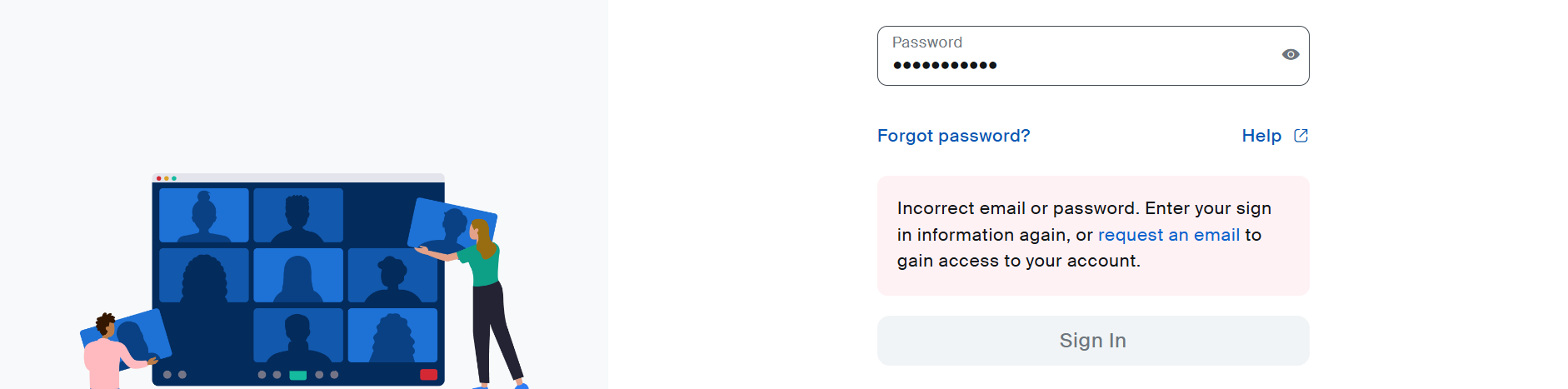
Now, imagine trying to log into an app, mistyping your password, and being hit with an error message like:
"Something went wrong. Try again."
Not very helpful, right? Poorly written error messages can frustrate users, increase churn, and even damage trust. On the flip side, clear, empathetic, and actionable microcopy can turn a moment of friction into an opportunity to guide and delight your users.

Ever wondered how Steve Jobs might view user experience and AI today?
Jen from BlatzChatz playfully constructs a mock interview with Steve Jobs in 2024, imagining his perspective on technology, the importance of UX research, and the role of AI in the creative process. It's a fun and insightful take on how Jobs might prioritize design thinking and AI’s influence on creativity.
Check out the video here:
👉 This insightful content is brought to you by BlatzChatz, a platform sharing UX tips, product insights, and strategies to help everyone level up their UX game.
Today’s Highlights
Key Insight: The Complete Guide to Writing Error Microcopy
Why Error Microcopy Matters
The Anatomy of a Great Error Message
Common Pitfalls to Avoid
Proactive Validation: Prevent Errors Before They Happen
How Do You Measure Success in Microcopy?
Examples of Microcopy Gone Wrong
Spotlight Case Study
Practical Tips: Actionable Strategies for Crafting Error Microcopy
Upcoming Workshop — A live class on prompt engineering
Job Board: Fresh UX Roles Just for You
Resource Corner: Tools and Reads to Hone Your Microcopy Skills
Tool of the week!
Key Insight: The Complete Guide to Writing Error Microcopy
Error messages are inevitable, but bad ones are not. Crafting thoughtful microcopy ensures that users feel supported, not abandoned, when things go wrong. Whether it’s a missing form field, a failed payment, or a loading error, effective error microcopy provides clarity, guidance, and empathy.
Here’s how to level up your error messaging game.
1. Why Error Microcopy Matters
A good error message is more than just an alert. It’s an opportunity to:
Prevent User Frustration: Help users understand what went wrong and how to fix it.
Increase Task Completion Rates: Actionable guidance reduces drop-offs and gets users back on track.
Build Brand Trust: Clear, empathetic messaging shows that your product supports the user.
2. The Anatomy of a Great Error Message
A. Context
Make it clear what the user was doing when the error occurred. Specificity helps users troubleshoot quickly.
Bad: "Something went wrong."
Better: "Your password must include at least 8 characters, including a number."
B. Guidance
Provide actionable steps users can take to fix the issue.
Bad: "Invalid email."
Better: "That email doesn’t look right. Check for typos or use a valid email format like [email protected]."
C. Tone
Error messages don’t have to be robotic or overly formal. Match your brand’s tone but stay empathetic.
Friendly: "Oops! Looks like you missed a required field. Let’s fix it."
Professional: "This field is required. Please complete it to continue."
3. Common Pitfalls to Avoid in Error Microcopy
While creating error messages, avoid these common mistakes:
Vagueness: Users shouldn’t have to guess what went wrong.
Overloading with Jargon: Keep it simple and understandable for all users.
Blame: Avoid language that makes the user feel at fault, e.g., "You entered an invalid password."
4. Proactive Validation: Prevent Errors Before They Happen
Error microcopy doesn’t have to appear only after a problem arises. Adding real-time validation during form entry or workflows can prevent errors altogether.
For example: As users type an email, show a validation message like "Valid email!" or "This email format doesn’t look right." These proactive nudges reduce the need for error messages and guide users toward success.
5. How Do You Measure Success in Microcopy?
Writing clear error messages is important—but how do you know they’re working? Here are three key metrics to track:
Task Completion Rates: Are users successfully resolving issues after encountering an error? Compare task success rates before and after updating microcopy.
Support Ticket Reduction: Clear microcopy should reduce the need for users to contact support. Measure the change in error-related tickets.
User Satisfaction Scores (CSAT/NPS): Collect feedback through surveys to gauge how users feel about your error resolution process.
By measuring these metrics, you can identify gaps and continuously improve your microcopy.
6. Examples of Microcopy Gone Wrong
Let’s look at examples of vague or unhelpful error messages—and how we can improve them.
Bad: "Something went wrong."
Improved: "We couldn’t connect to the server. Check your internet connection and try again."Bad: "Invalid input."
Improved: "Your password must include at least 8 characters and one number."Bad: "An error occurred while processing your request."
Improved: "Payment failed. Please check your card details or try another payment method."
By being specific, actionable, and user-friendly, you can turn frustrating experiences into opportunities to build trust.
Spotlight Case Study: Designing Motivation into the Manuva Fitness App
This week, we’re reviewing an inspiring case study from Tubik Studio, where they partnered with Manuva Group to create a fitness app for users to connect with personal trainers across various gyms. This project highlights how effective UX and UI design can make fitness services more accessible and engaging.
Key Highlights from the Manuva Case Study
1. Goal-Driven Design
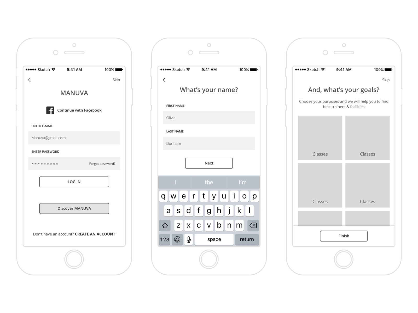
The Manuva app was designed to let users find and book personal trainers nearby without needing a gym membership. Tubik’s UX process began with wireframes that mapped out user flow and visual hierarchy, including a unique “Discover Manuva” button for non-registered users to explore the app first.
2. Simple, Functional Navigation
With dual navigation options—a list and map view—users can easily browse and book trainers or classes. The clear layout and bottom tab bar ensure that essential features, like finding trainers, are just a tap away, minimizing friction.
3. Youthful, Branded UI

The final design features a white background with blue and pink accents, creating an energetic yet clean look. Custom icons and illustrations in the onboarding sequence introduce users to the app’s core features, reinforcing the brand's youthful, welcoming appeal.
Impact: By combining intuitive navigation with vibrant visuals, Tubik Studio delivered an app that aligns with Manuva’s mission to make personal training accessible, engaging, and easy to book.
Have a UX story worth sharing? Send us your case study HERE! to be featured in our next issue!
Practical Tips: Actionable Strategies for Crafting Error Microcopy
Focus on Actionable Language
Use language that guides users toward fixing the issue. For example, instead of "Invalid input," say, "Your password must include at least 8 characters and a number."Be Consistent
Keep the tone, style, and structure of error messages consistent across your app. This reduces cognitive load for users.Test with Real Users
Conduct usability testing to ensure your microcopy is clear and effective. If users can’t understand your error messages in testing, rewrite them.Avoid Negative Phrasing
Instead of blaming users (e.g., "You made an error"), use neutral phrasing like, "Let’s fix this together."Include Helpful Links
If users need further help, include links to FAQs or support pages directly in the error message.
Upcoming Workshop

For most of us, AI does play a key role in your day-to-day work and there are challenges we encounter in the process especially with trying to get these tools to understand what we are looking for.
Knowing how to set the right prompts can be a game-changer. In this workshop, you’ll gain practical, hands-on experience with the art of prompt engineering. You’ll be guided you through the processing of crafting clear, context-rich prompts that help you get the most out of ChatGPT to enhance your research and discovery process.
Bonus: You’ll get to walk away with an exclusive e-book on how to leverage on ChatGPT as your personal UX assistant!
👉 Ready to boost your productivity and design smarter?

UX Researcher - USDSUX Researcher - USDS with verification
TikTok/ Los Angeles, CA / $97.3K/yr - $158.8K/yr · Medical, 401(k), +1 benefit
TikTok Shop Senior UX Designer - ConsumerTikTok Shop Senior UX Designer - Consumer with verification
TikTok / Seattle, WA / $130.4K/yr - $243.1K/yr · Medical, 401(k), +1 benefit
User Experience ResearcherUser Experience Researcher with verification
Aquent / London Area, United Kingdom (Hybrid) / £99K/yr
Senior User ResearcherSenior User Researcher with verification
Anson McCade / London Area, United Kingdom (Hybrid) / £65K/yr - £75K/yr
Principal User Experience DesignerPrincipal User Experience Designer with verification
Autodesk/ Toronto, ON (Hybrid)/ Salary *Not stated*
Ui/ux Design InternUi/ux Design Intern
Zopsoft Technology Private Limited / Delhi, India (Remote) / ₹5,000/month - ₹10K/month
Resource Corner: Books, Tools & Articles
Tool of the week: Hemingway App

The Hemingway App is a game-changing tool for UX writers. It helps you simplify complex text, making it scannable and easy for users to understand.
Here’s what the Hemingway App can do right now:
Highlight long or overly complex sentences for simplification.
Identify passive voice and suggest alternatives.
Grade readability so you can write content that is accessible to all audiences.
Final Note | Clarity Wins Every Time
Error messages are small but mighty. By turning frustrating experiences into clear, empathetic, and actionable moments, you can build trust and improve your product's usability.
Thanks for being part of the UXU community! If you enjoyed today’s insights, share this with a friend or colleague who could benefit.