
Storyboarding for UX Teams: Visualizing Empathy
Turning user insights into something everyone can see, and feel.


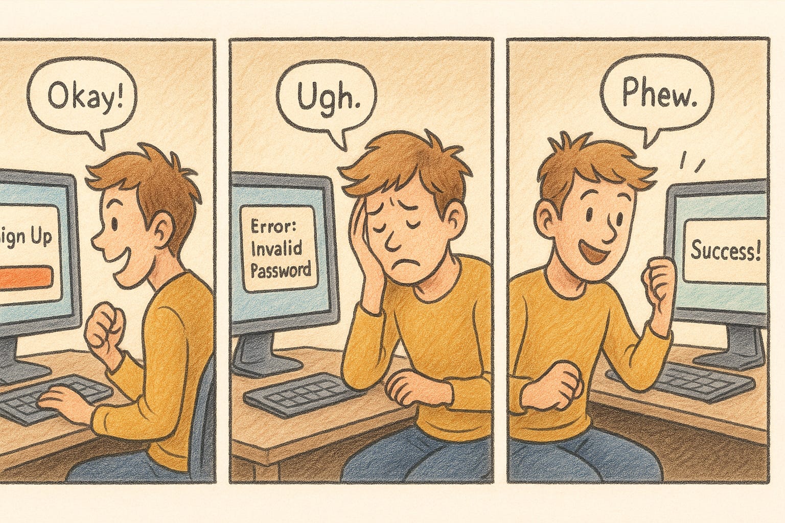
Picture this: a researcher presents their findings in a team meeting.
“The user got frustrated during sign-up.”
The PM nods. The designer scribbles notes. The engineer opens Jira.
And just like that, the moment passes. The user’s frustration becomes a bullet point on a slide, not something anyone feels.
Now imagine instead… a few simple sketches.
You see the user’s face as they try to sign up.
The hesitation before clicking “Submit.”
The sigh when the page reloads.
The frustration that spreads across the room as the team watches.
That’s what storyboarding does. It turns data into empathy, and empathy into action.
In This Issue
Why Storyboards Matter in UX
Step-by-Step: How to Create a UX Storyboard
Tips for Teams (Even If You Can’t Draw)
Common Mistakes and How to Avoid Them
Tools and Templates for Faster Storyboarding
Resource Corner
Why Storyboards Matter in UX
Research reports are great for what happened.
Storyboards show why it matters.
They help teams:
See emotion: what the user feels in each moment.
Spot friction: where pain points show up naturally in context.
Align quickly: everyone understands the story, even without UX jargon.
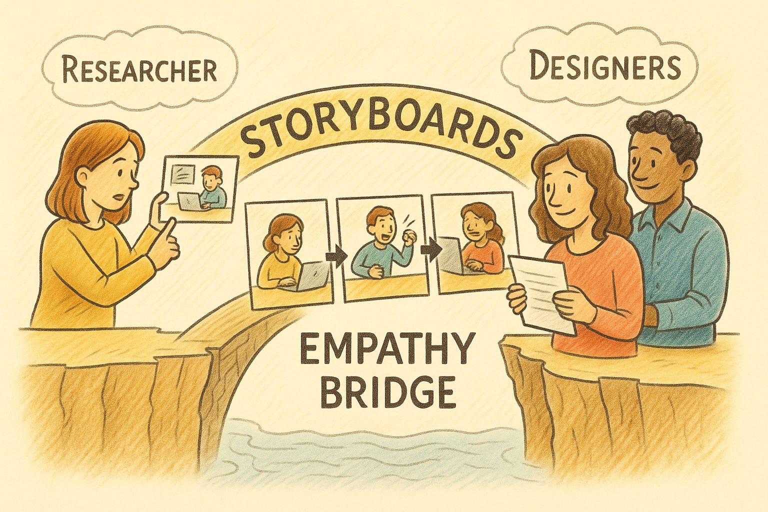
A good storyboard builds a shared language across design, product, and engineering. It takes empathy out of the research file and puts it on the wall, where decisions happen.
Step-by-Step: How to Create a UX Storyboard
1. Start with the Goal
What’s the moment you’re trying to explain?
Maybe it’s checkout confusion, trust drop-off, or post-purchase anxiety.
Pick one clear scenario, not an entire journey.
2. Choose Your Character
Give the user a small story:
“Maya, a busy working mom, tries to order groceries on her commute home.”
This helps the team visualize a real human, not a persona profile.
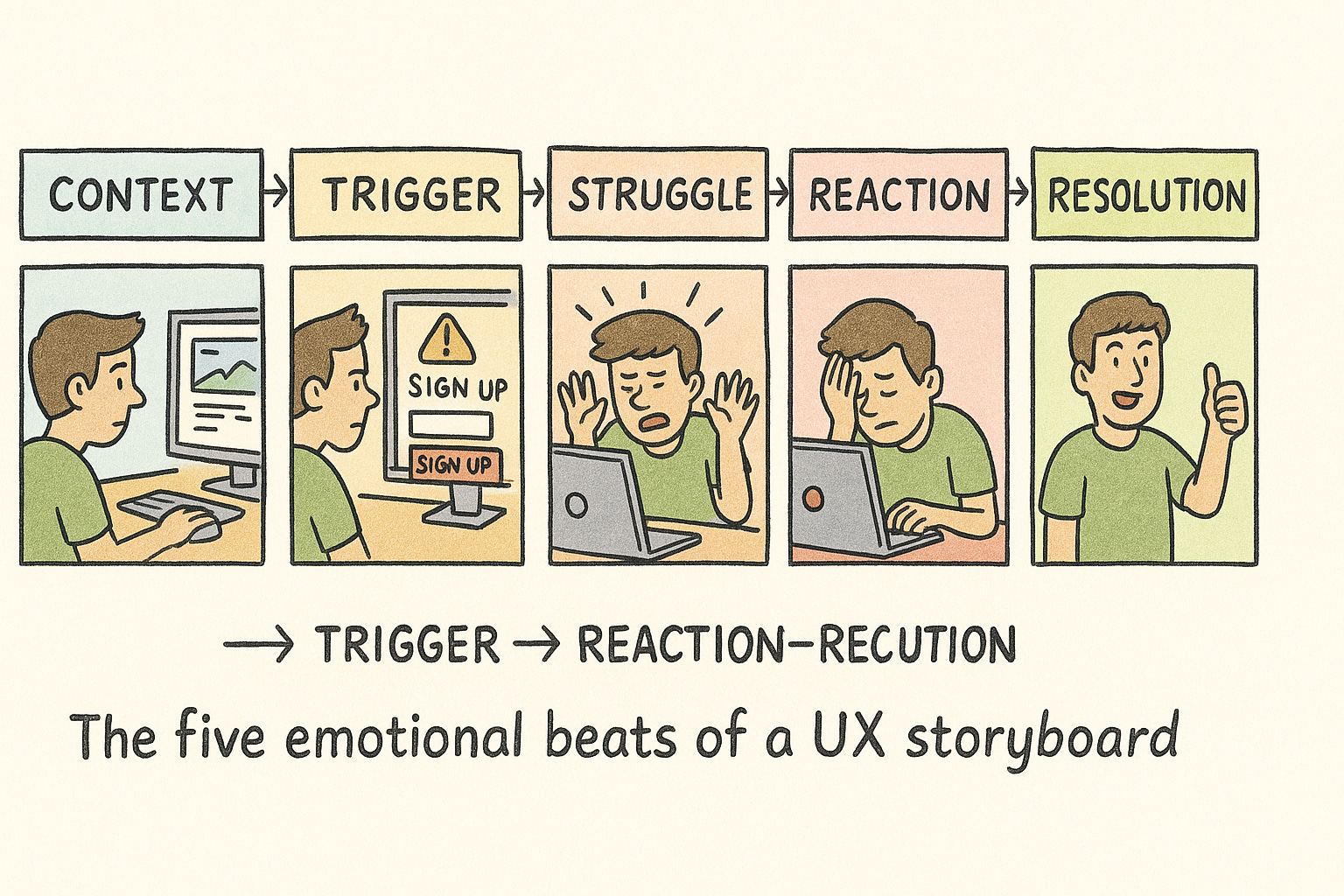
3. Map Key Moments
Every storyboard follows five emotional beats:
Context — where the story starts
Trigger — what the user wants to do
Struggle — what goes wrong
Reaction — how they feel
Resolution — what happens next
4. Add Emotion and Environment
Facial expressions. Posture. Small environmental clues.
A half-drunk coffee mug. A loading spinner. A frown.
These micro-details make the story human and relatable.
5. Review Together
Share your storyboard early.
Ask: “Does this feel real?”
If not, tweak the story, not the drawings.
Storyboarding is less about artistry and more about accuracy of emotion.
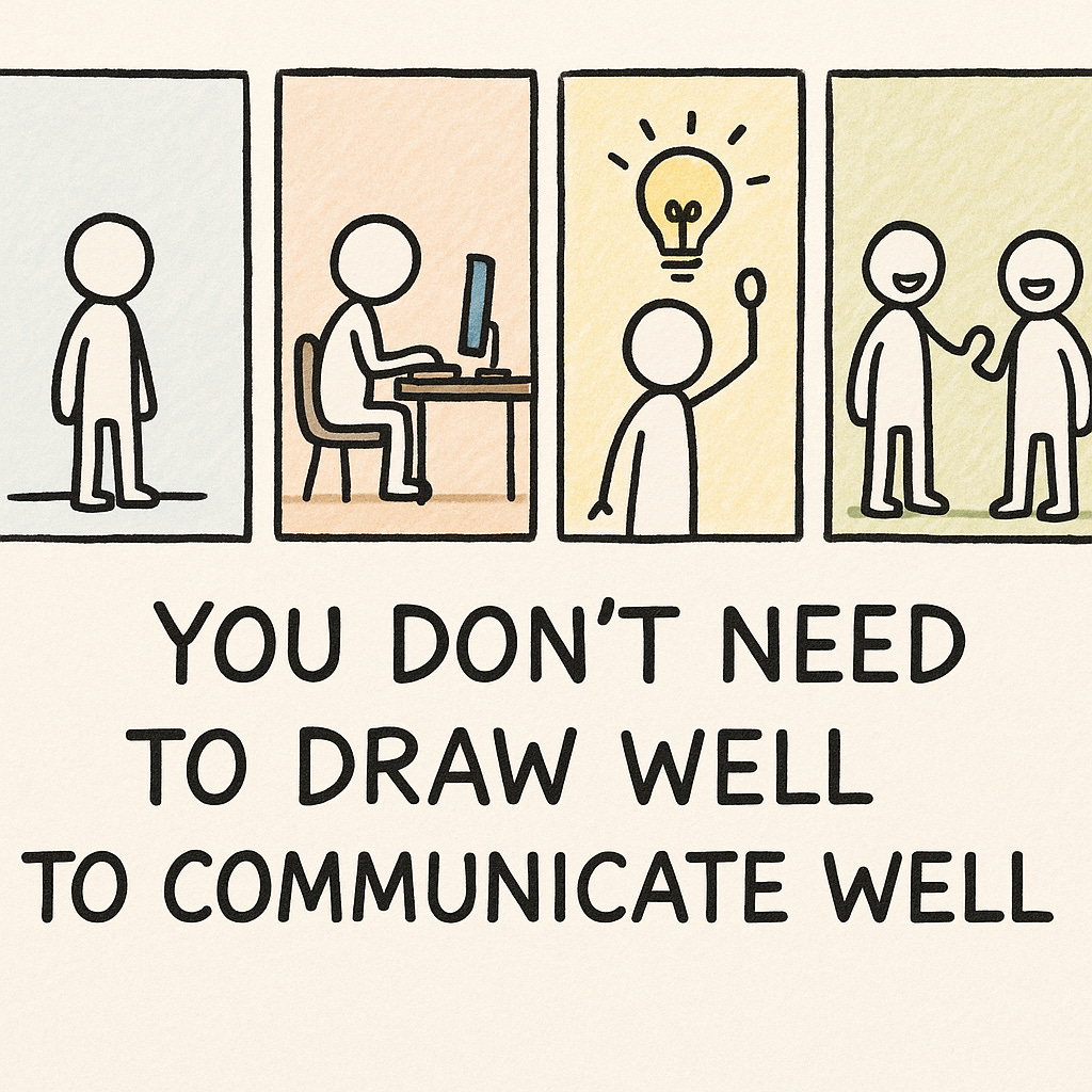
Tips for Teams (Even If You Can’t Draw)
Stick figures are perfectly fine.
Caption emotions clearly (“confused,” “relieved,” “stressed”).
Combine icons, photos, and short text if sketching isn’t your strength.
Keep it to 6–8 panels, more than that and the story loses focus.
Reuse your journey map as the backbone for your storyboard.
Common Mistakes and How to Avoid Them
❌ Too much text → Storyboards are for visuals. Let the images carry the story.
❌ Skipping context → Always show where the user starts and why.
❌ Only happy paths → Include frustration, confusion, or moments of doubt — they reveal the real insight.
❌ Treating it as documentation → A storyboard is a conversation tool, not a deliverable.
Tools and Templates for Faster Storyboarding

Final Thought
Storyboards don’t just show what users do, they show what users feel.
And feelings are what drive action.
So the next time you’re explaining a usability issue, skip the spreadsheet.
Grab a pen. Sketch a moment.
Let your team see the story for themselves.
Because the best UX decisions don’t come from reports...
They come from empathy you can see.