Revisiting Hick’s Law in an AI World
A Quick Refresher on Hick’s Law
Choice overload isn’t going away. AI just hides it better.
Hick’s Law says: the more options you give someone, the longer it takes them to decide.
It’s why we simplify menus, group settings, and trim options down to the essentials.
But here’s the twist: in an AI-driven world, we aren’t just showing users options, we’re generating them. Recommendations, AI-written text, custom dashboards. Suddenly the “menu” isn’t 10 items long. It’s infinite.
This issue looks at whether Hick’s Law still applies, how AI reshapes the decision landscape, and what UX needs to do when the machine never runs out of choices.
A Quick Refresher on Hick’s Law
How AI Changes the Decision Space
Why Infinite Choice Is Still a UX Problem
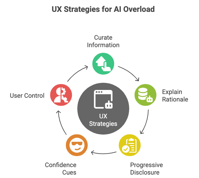
5 UX Strategies for Reducing AI Overload
Real-World Examples (Good and Bad)
UXCON25 Spotlight: Designing for Decision Clarity
Resource Corner
A Quick Refresher on Hick’s Law
Hick’s Law is simple: the more options users have, the longer they take to choose. And longer choice times often equal more friction, confusion, and drop-off.
It’s why Google’s homepage was famously simple. It’s why Amazon personalizes menus instead of listing every product. And it’s why “decision fatigue” is a real thing: our brains burn out when faced with too many forks in the road.
How AI Changes the Decision Space
AI doesn’t give us static menus anymore it generates choices dynamically:
ChatGPT suggests five alternative phrasings.
Spotify recommends dozens of “made-for-you” playlists.
Netflix autogenerates cover art based on what you’re likely to click.
It feels like personalization, but it also creates a paradox of choice in disguise.
Because behind every “smart suggestion” are hundreds of hidden alternatives that users will never see.
AI reduces surface complexity… but it doesn’t eliminate decision-making strain.
Why Infinite Choice Is Still a UX Problem
Even when options are personalized, users can still feel overwhelmed:
Ambiguity: “Which AI suggestion is the right one?”
Distrust: “Did the AI miss something better?”
Fatigue: “Do I have to evaluate 5, 10, 20 generated options every time?”
Instead of Hick’s Law disappearing, it’s mutating. The challenge isn’t just more options - it’s hidden, constantly changing options.
UXCON25 Spotlight: Designing for Decision Clarity
At UXCON 25, we’re asking: How do you design for clarity when AI keeps generating more?
At UXCON25, we’ll explore:
How one product team redefined Hick’s Law inside an AI recommendation engine
How a fintech startup built trust by showing why choices were surfaced
Why decision fatigue is quietly becoming one of the biggest UX problems of the AI era
And here’s the best part → Thanks to Great Question’s sponsorship, tickets are more affordable than ever. That means the doors to these conversations, and the community behind them, are now open wider than before.
👉 Join us at UXCON25 and be part of the clarity in an AI-driven world.
back to where we stopped
5 UX Strategies for Reducing AI Overload
Curate, Don’t Dump
Show fewer AI outputs by default. Give users a “See More” option rather than flooding them.Explain Why
Add context to recommendations: “We suggested this because you liked X.”Progressive Disclosure
Start with one strong option, let power users dive deeper if they want.Confidence Cues
Rank AI outputs with indicators of reliability or relevance.User Control
Allow filtering or re-prompting, so users can steer the AI instead of drowning in its outputs.
Examples (Good and Bad)
Good: Spotify
Instead of showing all possible playlists, it creates 6 “Daily Mixes.” Users get choice without overwhelm.Good: Grammarly
Suggests one primary edit at a time with context. Additional options are hidden behind a click.Bad: Early AI writing tools
Dumped 10+ variations with no context, leaving users confused and less confident in any option.
AI doesn’t break Hick’s Law. It just puts new pressure on how we frame choices.
Resource Corner
Final Thought
Hick’s Law isn’t dead. It’s evolving.
In the AI era, the problem isn’t just too many options… it’s invisible abundance, constant generation, and user doubt.
Our job as designers is to shield users from overload while giving them confidence in the choice they make.
Because at the end of the day, simplicity still wins. Even when AI wants to give us infinity.


It's important to point out that Hick's law does not strictly say that choice time increases with the number of choices. It says that choice time increases logarithmically. Most posts about Hick's law don't mention this.
This really matters when it comes to design application because the design rationale when deciding between 3 or 4 choices is going to be very different from 15 or 16 choices.