
From UX to HX: Designing for Human Experience In 2025
Why user flows aren’t enough anymore.


UX has always been about usability, clarity, and efficiency. But let’s be honest: nobody remembers the “efficient” part of an app.
They remember how it made them feel.
That’s the shift from UX (User Experience) to HX (Human Experience).
It’s not just about making something easy to use — it’s about designing products that fit into lives, values, and emotions.
This issue unpacks what HX really means, why it matters now, and how to build it into your product strategy without getting lost in buzzwords.

UX vs. HX: What’s the Real Difference?
Why HX Matters More in 2025
The 4 Pillars of Human Experience Design
Practical Ways to Add HX to Your Current UX Practice
How HX Connects to Business Outcomes (Retention, Loyalty, Trust)
The Risks of Ignoring HX in Product Design
Examples of HX in Action
Common Mistakes Teams Make When “Doing HX”
UXCON25 Spotlight: Designing Beyond the Interface
Resource Corner
UX vs. HX: What’s the Real Difference?
UX is task-focused: Can the user complete what they came here to do?
HX is life-focused: Did this experience make their day better, easier, or more meaningful?
Think of it like this:
UX asks: Was it usable?
HX asks: Was it valuable?
Good UX prevents frustration.
Good HX creates connection.
Why HX Matters More in 2025
Because usability is no longer a differentiator.
Design systems, templates, and AI tools have lowered the bar. Today, “usable” is just expected.
What people notice now:
Apps that respect their time and attention
Products that adapt to their context (not just clicks)
Companies that feel human, not transactional
HX is how you break through in a world where basic UX is table stakes.
The 4 Pillars of Human Experience Design
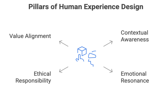
Contextual Awareness
Design for the life around the product, not just the screen in front of it.Emotional Resonance
Build moments of delight, trust, or relief… emotions drive memory.Ethical Responsibility
Respect privacy, avoid dark patterns, prioritize transparency.Value Alignment
Connect the product to bigger human goals: well-being, belonging, or progress.
Practical Ways to Add HX to Your Current UX Practice
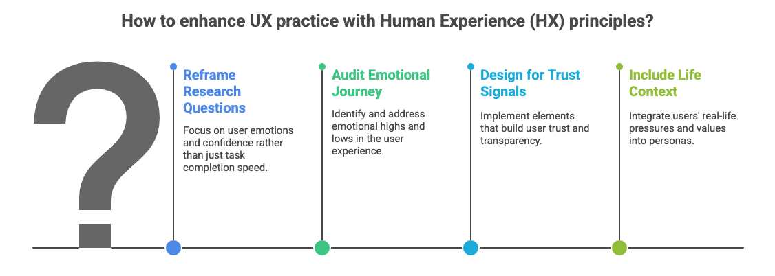
Reframe research questions
Instead of: “How fast did users complete checkout?” → Ask: “Did they feel confident checking out?”Audit the emotional journey
Map highs and lows in the experience. Where does frustration creep in? Where could you add reassurance or joy?Design for trust signals
Use progress indicators, plain-language explanations, and transparency about data use.Include life context in personas
Don’t just document roles and tasks… include pressures, values, and tradeoffs people juggle outside the screen.
How HX Connects to Business Outcomes
HX isn’t fluff. It directly impacts metrics:
Retention: Users stick around when they feel valued, not just “serviced.”
Loyalty: Emotional connection builds brand advocates.
Trust: Transparent design reduces churn and increases adoption.
The companies winning in 2025 aren’t just usable. They’re trusted, human, and aligned with what people care about.
The Risks of Ignoring HX in Product Design
When companies stop at UX, they risk:
Becoming interchangeable (yet another “usable” tool).
Burning out users with constant notifications, nudges, or friction.
Creating technically correct, emotionally hollow experiences.
It’s not that UX without HX fails it just fades.
Examples of HX in Action
Duolingo: UX = learning flows. HX = humor, personality, and encouragement that keep you coming back.
Headspace: UX = simple meditation sessions. HX = a calming brand voice and visuals that actually make you feel relaxed.
Apple Watch: UX = closing activity rings. HX = the small moment of pride when you do.
Common Mistakes Teams Make When “Doing HX”
Over-indexing on delight (adding cute animations everywhere without solving real problems).
Confusing brand personality with emotional connection. A quirky tone doesn’t equal trust.
Treating HX as “nice to have” instead of tying it to outcomes like retention, loyalty, or reduced churn.
HX isn’t an add-on - it’s a lens.
UXCON25 Spotlight: Designing Beyond the Interface
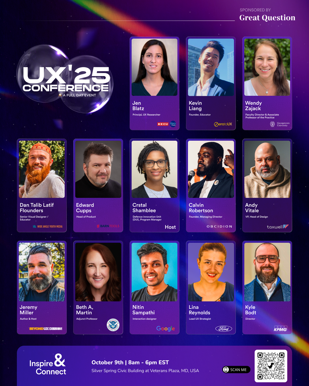
At UXCON25, we’ll go beyond wireframes to explore HX in practice:
How one startup designed not just for usability, but for dignity in healthcare apps
Why a research team mapped emotional journeys instead of just user flows
What leaders are learning about value alignment in products
And here’s the best part → Thanks to Great Question’s sponsorship, tickets are more affordable than ever. That means the doors to these conversations, and the community behind them, are now open wider than before.
👉 Join us at UXCON25 and be part of the conversation
Resource Corner
Final Thought
UX will always matter. People still need clear paths, fast flows, and usable products.
But the real opportunity? Designing products that actually matter in people’s lives.
HX is that bridge. It’s the difference between being just another app on the phone… or the one they can’t imagine living without.