Designing UX for Complex Products Without Losing Your Mind
How to keep clarity when your app does 47 different things
Some products are simple: a landing page, a mobile app with three main tasks, a checkout flow.
Others... feel like an entire city.
Multiple user types. Dozens of workflows. Data everywhere.
Complex applications aren’t just harder to design … they’re harder to understand.
That’s where strategy steps in.
This issue is about taming the complexity without oversimplifying it.
Because clarity for the user is the real measure of design maturity.
Why Complex Products Fail
How to Think in Systems, Not Screens
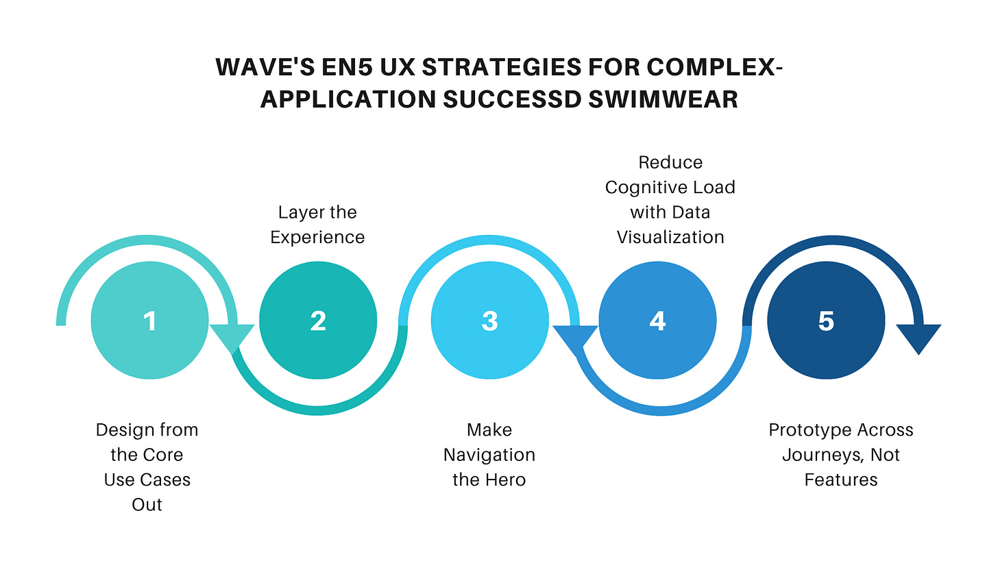
5 UX Strategies for Complex-Application Success
Common Pitfalls (And How to Avoid Them)
Real-World Examples You Can Steal From
UXCON25 Spotlight: Designing for Scale
Resource Corner
🛑 Why Complex Products Fail (It’s Not the UI)
The most common problem with complex applications isn’t “bad” design it’s fragmented thinking.
Teams optimize individual features without considering how they connect.
Users bounce between tabs, dashboards, and modals, unsure if they’re making progress.
When everything is important... nothing is.
before we continue….
UXCON25 Spotlight: Save 25%Today
Enjoy 25% Off Your UXCON25 Ticket… This Week Only
We’re opening up a special last-chance early bird offer: 25% off UXCON25 tickets, available until Friday.
It’s the perfect time to secure your spot and join conversations that tackle the toughest challenges in UX:
How a SaaS team cut onboarding time by 60% in a data-heavy product
How a health tech platform brought 12 disconnected workflows into one smooth system
Why scaling DesignOps is the key to keeping complex apps usable
We’d love to see you there… learning, sharing, and connecting with UX professionals from around the world.
back to where we stopped…
How to Think in Systems, Not Screens
Complex UX design starts with mapping the mental model not just wireframing.
Ask:
Who are the different user types?
What are their main goals?
Where do their workflows overlap or conflict?
What data is shared, and what’s siloed?
Once you see the whole, you can design the parts with intention.
5 UX Strategies for Complex-Application Success
Design from the Core Use Cases Out
Start with the 2–3 workflows that deliver the most value. Nail those before adding peripheral features.Layer the Experience
Give beginners a guided path, while letting experts bypass steps. Progressive disclosure is your friend.Make Navigation the Hero
If users can’t find it, they can’t use it. Keep primary navigation visible and predictable.Reduce Cognitive Load with Data Visualization
Replace text-heavy tables with visual summaries, filters, and context-specific drill-downs.Prototype Across Journeys, Not Features
Test how workflows connect, not just how a single screen behaves.
⚠️ Common Pitfalls (And How to Avoid Them)
Overloading the UI with every possible option up front
→ Use contextual menus and progressive disclosure.Ignoring onboarding
→ Teach users the logic of the system, not just where buttons are.Designing in silos
→ Cross-functional reviews aren’t optional — they’re survival.
🌍 Real-World Examples You Can Steal From
Salesforce Lightning Experience – Modular components that adapt to different roles.
Salesforce Lightning OverviewFigma – Complex collaborative workflows distilled into simple, real-time interactions.
Figma Product TourAtlassian Jira – Role-specific dashboards that hide unnecessary complexity for new users.
Jira Software Overview
📚 Resource Corner
Final Thought
The complexity of the product doesn’t have to be the complexity of the experience.
Your job isn’t to remove complexity it’s to organize it.
Give users clarity. Give teams structure.
Because the best complex UX isn’t just usable. It’s empowering.


